For clinicians, every recommendation matters – especially when it comes to products that become part of someone's everyday life. As we celebrate National Wheelchair Beautification Month, there's no better time to talk about the transformative power of color in mobility – and how Sunrise Medical is setting a new bar for both personal expression and clinical relevance with our newly reimagined QUICKIE and ZIPPIE color palettes.
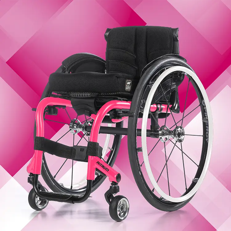 Pink Power + Starlight White
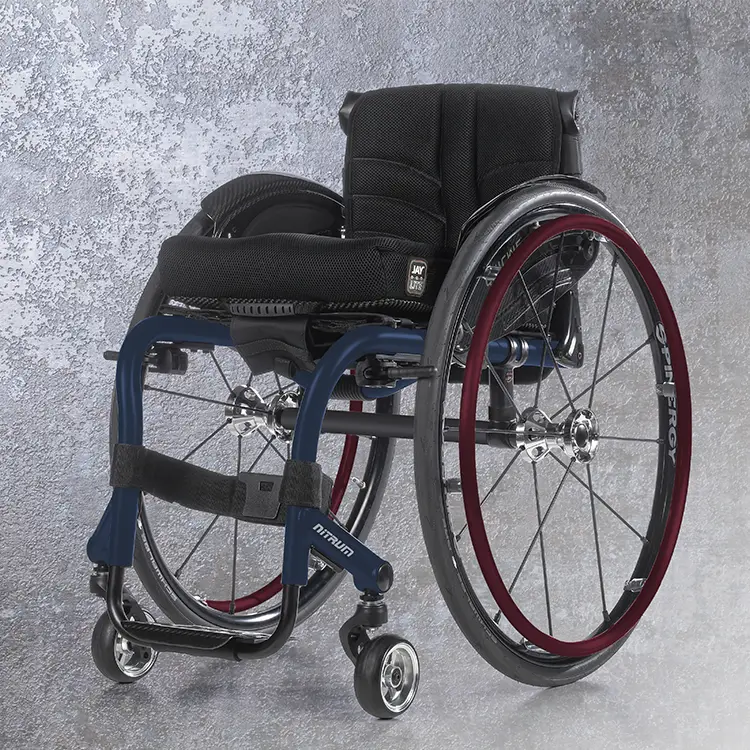 Celestial Sapphire + Scarlet Noir
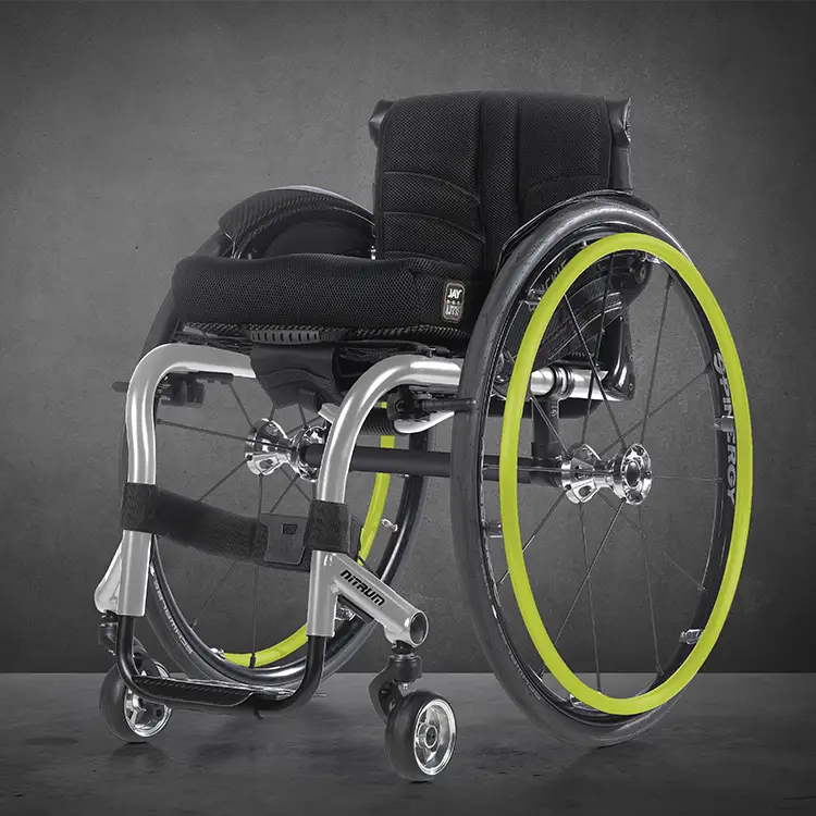 Silver Ore + Turbo Green
Why color matters in clinical practice
While performance, fit, and function are top priorities in wheelchair prescription, visual appeal can have a profound impact, especially when it comes to confidence, identity, and ownership of mobility. The right color can help a rider feel more connected to their chair, boosting self-confidence, user satisfaction, and overall body image. This impactful decision is truly the rider's own and can help them take ownership of their chairs.
The discussion of color choices was always an important moment during an evaluation in my clinic, no matter the age of the client. Sometimes this was a quick and easy decision, and other times there was consultation with others about what they thought was the "right" choice. During a recent evaluation, a little boy was getting his first chair. The family was deciding between two very similar chairs, and the therapist and mom were in deep discussion on the different options. The boy was shown the color choices and immediately picked out the blue on the color swatch because it was his favorite color and matched his shoes and "made him shine." He proudly carried the color swatch with him during the rest of the appointment, showing everyone in the clinic the color of his new chair that he picked himself.
This was one of many similar situations over the years where this thoughtful decision made an impact. That's why we didn't just add a few trendy shades; we completely redesigned our color range with clients in mind.
The new palette: a blend of science, style, and self-expression
We introduced the first colorful wheelchairs over 40 years ago. Today, we're doing it again with a modern palette designed to coordinate, reflect, and inspire. Our updated color collection wasn't chosen on a whim. We did our homework, diving into:
- Automotive, biking, and motorcycle design for durability, finishes, and timeless appeal.
- Fashion, interior design, and personal style to reflect what riders actually want.
- Competitive and industry benchmarks to ensure we stand out.
- Internal sales data to focus on what truly resonates with clients.
The result? A curated selection that's versatile, modern, and coordinated.
 Storm Gray + Scarlet Noir
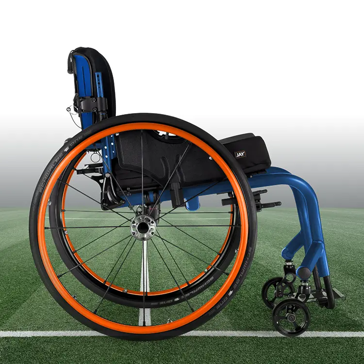 Royal Blue + Solar Orange
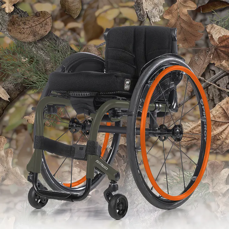 Salute Green + Solar Orange
What's new?
We've shifted away from overly complex, multilayer finishes that added cost without broad appeal. Instead, we're offering the colors people love most, backed by data:
- Timeless neutrals: including rich blacks, soft grays, and clean whites
- Cool blues: from bold statements to relaxed classics
- Vibrant reds: because sometimes, your style needs to shout a little louder
Each shade is professionally designed to work with other components of the chair and with the rider's personal style.
Style for every stage of life
Whether you're fitting a toddler in a ZIPPIE or working with a veteran who wants to reflect pride and presence, our new palette adapts to the rider and not the other way around.
- Bold and expressive? We've got that.
- Sophisticated and subtle? Absolutely.
- Outdoorsy, professional, fun, or edgy? Check, check, check, and check.
No matter the age, lifestyle, or personal aesthetic, this palette invites everyone to take ownership of both their mobility and their look. With the QS5 X visualizer on our website, you can design your own look, choosing from frames, cross braces, handrims, and more!
Built-in sustainability
We're also proud to say this redesign supports a more sustainable future. These finishes are designed with the environment in mind by reducing waste and energy consumption associated with complex custom finishes, so these new color options are as responsible as they are stylish.
Your role in Beautification Month
National Wheelchair Beautification Month is a perfect opportunity to remind your clients that mobility doesn't mean compromising style. As clinicians, you help shape not just physical outcomes, but emotional outcomes, too. While some may celebrate this month by adding decorations, we are simplifying and standing out. Take an opportunity to introduce these new colors to clients as they enter the clinic and explain all of the benefits.
This new range is more than a fresh coat of paint. It's a way to empower riders to feel proud, seen, and themselves. Encourage your clients to see their wheelchair not just as a mobility device, but as a part of their story. Because when your chair is a perfect fit, your colors should be, too.
Lindsey Veety
PT, DPT, ATP/SMS - Clinical Education Manager, US Northeast